Sargento Cheese New Products Campaign
During my time as a design intern at Sargento, I created a hypothetical email and Instagram campaign featuring three new products: Shareables, Spicy Shreds, and Natural American Cheese. My goals were to test the new brand guidelines and for my designs to serve as templates for later use.
Ideation
For the email campaign, I began by looking into the new brand guidelines to find common visual motifs and researching similar email campaigns from other food brands. Based on my findings, I then created sketches of potential email templates advertising the upcoming products.
*Click to enlarge
Experimentation
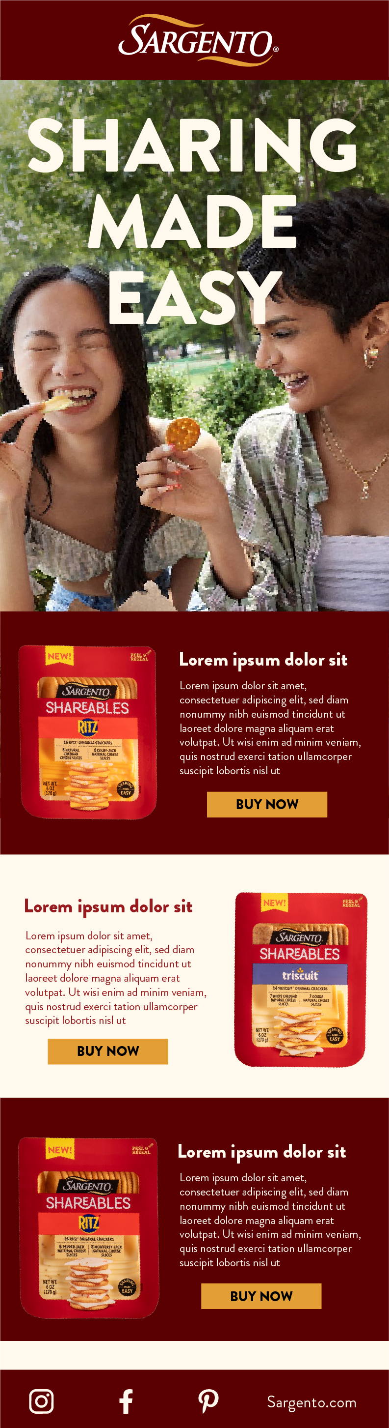
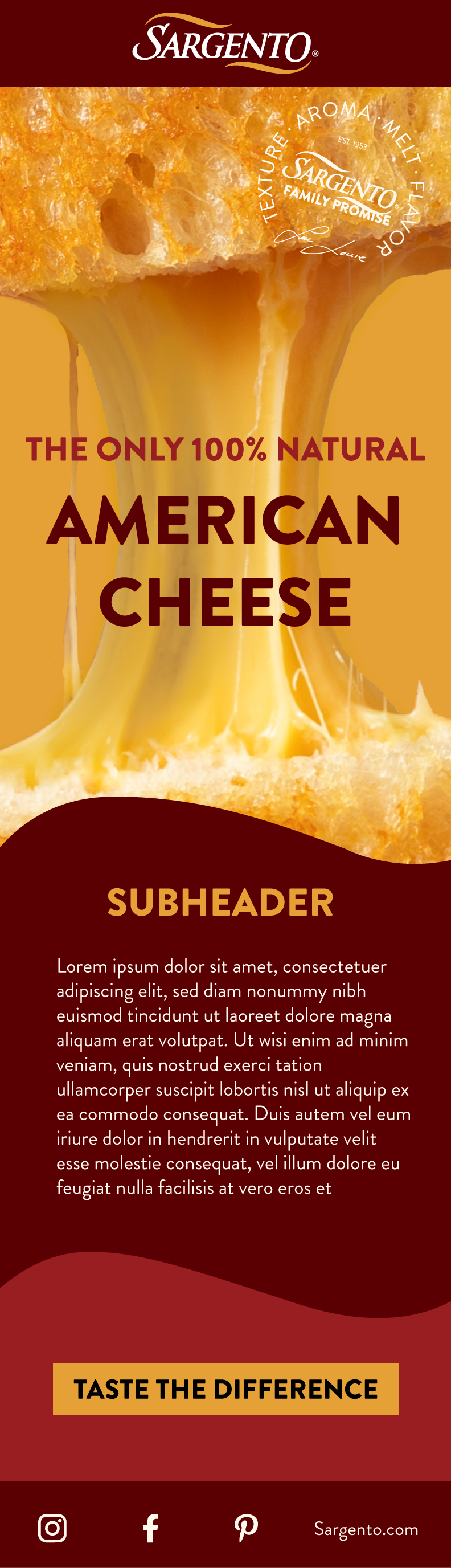
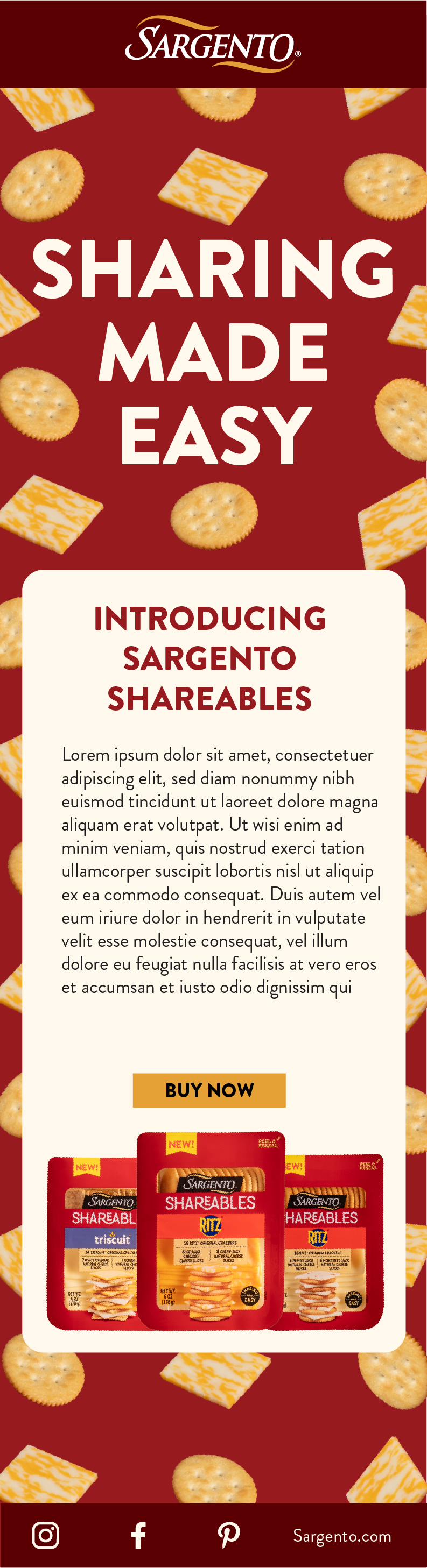
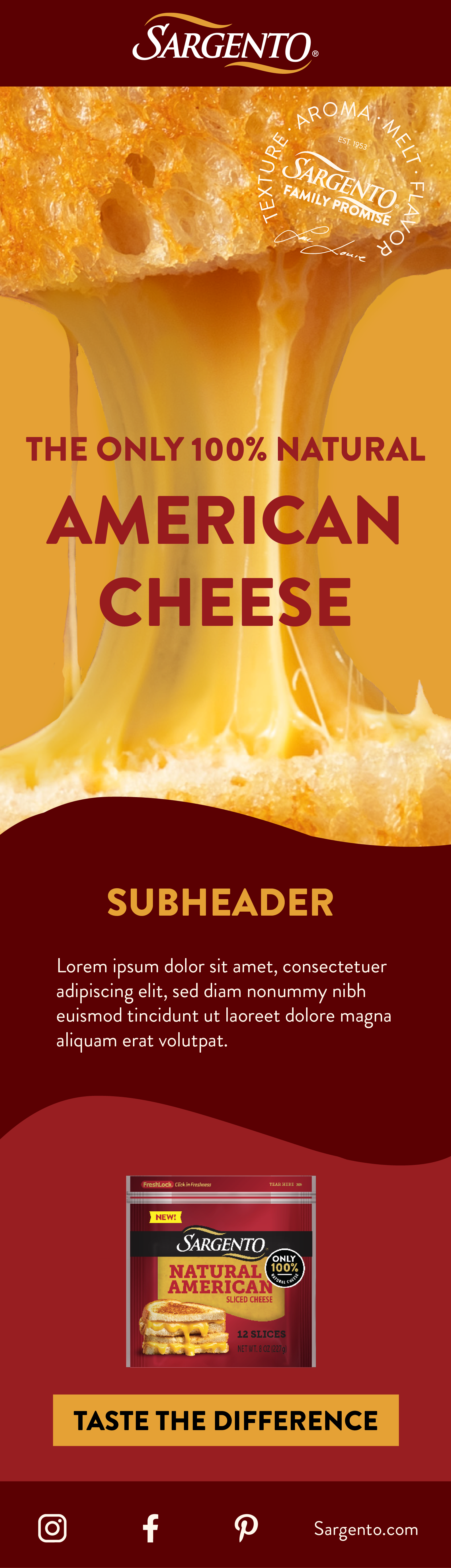
After getting feedback from the creative team, I brought the most successful sketches into Illustrator and began experimenting. I quickly discovered that simpler layouts and close-up photography worked best with the bright colors and bold typography of the new branding; anything too complex felt overwhelming and chaotic.
For example, the left design feels too busy. The photo is more focused on the people than the cheese, the section dividers feel bulky and there is far too much text. Instead of feeling bold and energetic, this design feels chaotic and overwhelming. The right design, on the other hand, works far better with the new brand guidelines. The bold type stands out from the simplified photography without feeling overwhelming, and the simplified layout feels refined and fun instead of blocky.
Refinement
After once more consulting the creative team, I refined the three most successful designs and submitted them to be used as templates in a future email campaign.
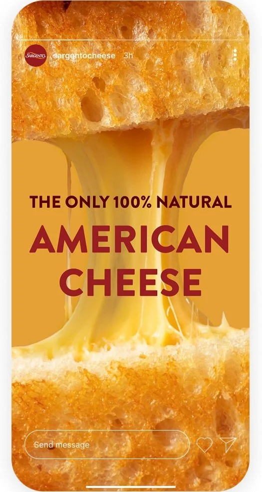
Social Media
Alongside the email templates, I created several Instagram posts using the same design elements as the emails. My goals were to show the deliciousness of the cheese and demonstrate how the same motifs can be used in many different contexts.